Treat the website, business profiles and day-to-day communications as parts of the same experience. Give the business a clearer online home and a more organised way to share its work.
Project notes
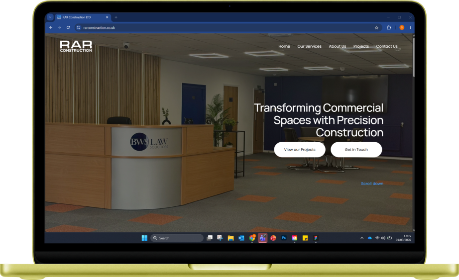
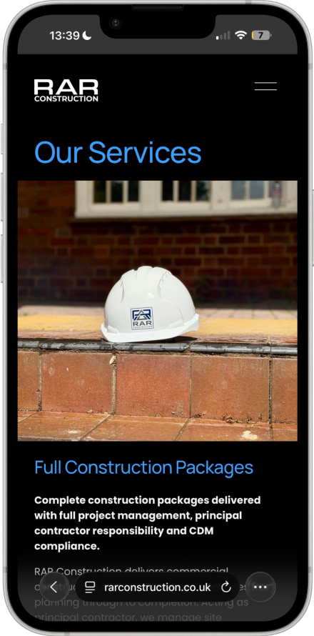
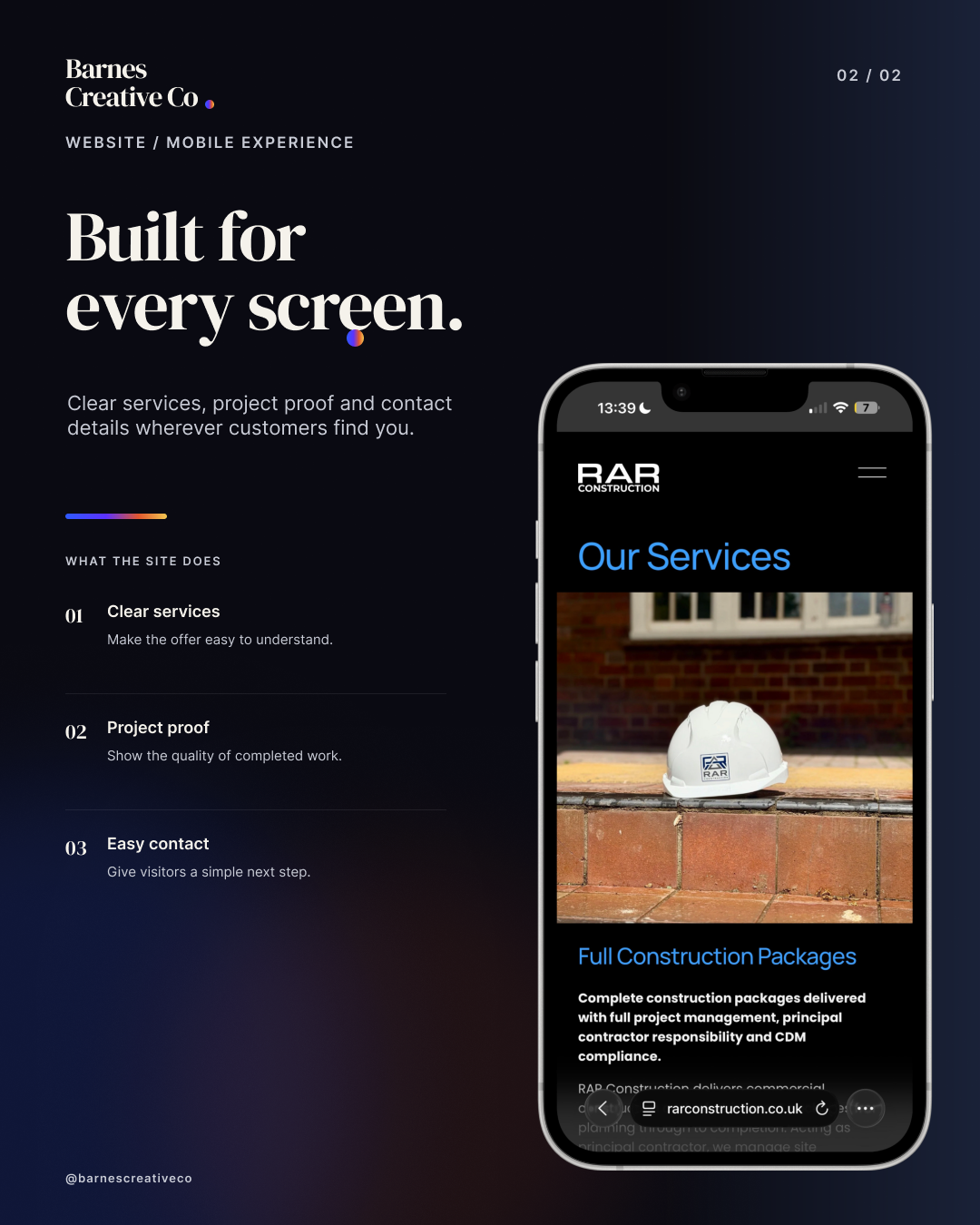
Explore the desktop and mobile mockups above to see the RAR website’s presentation across screens. Select either board to view the full artwork.
Product labels, print materials and social content for an independent nail business.
Product labelsPrintSocial content
Inside the BIAB by Imo project
The brief
Carry a consistent, considered presentation through the small details customers see and take away.
Scope snapshot
Cuticle-oil product labels
Multiple product variants
Gift-card artwork
Social media artwork and policy graphics
The thinking
Focus on readable information, careful spacing and a consistent visual treatment across small formats. The project brings attention to the details that sit around the service itself.
Project notes
The project brings product-label artwork, printed touchpoints and social content into one consistent customer-facing visual system.
An identity built around confident typography, a compact wordmark and a controlled thermal colour system.
Brand identityDigital designStudio project
Inside the Barnes Creative Co project
The brief
Create a distinctive visual language that can move consistently between a website, social content, print and everyday studio materials.
Scope snapshot
Thermal colour palette and gradient recipes
DM Serif Display and Inter typography
Compact stacked wordmark and thermal period
Social templates and website direction
The thinking
Use ink, deep navy and warm white as the foundation, with thermal colours reserved for moments of emphasis. Equal-size stacked lettering keeps the signature compact, while the thermal period gives it a recognisable finish.
Project notes
This is Barnes Creative Co’s own identity project, shown separately from client work.
A bold identity developed from logo concept through to finished business cards, including print fulfilment and a physical brand touchpoint ready to use.
Logo designBusiness cardsPrint fulfilment
Kie
Custom typography, social & 3D motion
A custom typography-led logo expanded into social media assets, a YouTube banner and a 3D animated logo treatment for a more complete digital identity.
Custom typographySocial media3D animation
Ibby’s Kicks
Logo design & business card fulfilment
A distinctive logo identity carried into business card design and print fulfilment, creating a polished physical piece that stays consistent with the brand.
Logo designBusiness cardsPrint fulfilment
Explore client branding, website, print and digital work alongside Barnes Creative Co studio explorations.
The thread through every project
A good-looking result. A reason behind it
Design decisions should reflect the business, speak to the right people and make the message easier to understand.
Every project has a different starting point. The care, consistency and attention to the everyday details stay the same.
Your next chapter starts here
Your next chapter could start here
Have a brand to launch, a website to rethink or work that deserves to be seen? Let’s talk about what it could become.

.jpg)
.jpg)
.jpg)